Northeastern Policies and Legal Notices
Editing information
Body Editing
If there are multiple sections in the body, all sections of the body should be identified with a heading. The heading tag is available in the toolbar.
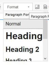
Heading 1 and Heading 2 are much too large for body content and are reserved for page headings. Heading 3 should be used for main headings and Heading 4 for sub headings. Do not use bold for headings. Screen readers use the heading tagging to allow visually impaired individuals to skim information until they find the heading of the content they are looking for. Bold would force the screen reader to have to read through all content.
You can customize body content within the normal body using the tools provided
B - Bold
I -Italic
S - Strikethrough
X2 -Superscript
X2 -Subscript
The Omega icon provides a selection of special characters that can be inserted.
When copying and pasting from other documents like word, sometimes the coded formatting from the source gets transferred over. Generally you will receive a message asking if you want the system to remove the source formatting, which you do. Sometimes the system doesn't catch it. The Website is designed to work on everything from a large monitor to your phone. If you do not remove the source formatting it will not allow the text to adjust the size dependent on the size of the device.
The Tx button will remove the source formatting on a selection if it doesn't get removed automatically.
Hyperlinks can be inserted into the body by using the little chain link icon. Please hyperlink a full statement instead of just the word "here" Visually impaired or keyboard only users are not getting a full explanation of where the hyperlink will take them with just the word "here" but they will if it says "Sign up for registration day here" If there is an existing hyperlink that you want to remove, the greyed out icon in the example will darken and you can click on the chainlink with the X to remove the hyperlink.
Please use the bullet and numbering tools on the toolbar instead of typing them in. This will maintain consistency in numbering as well as throughout the website. Content with bullets or numbering will cause the promotion demotion icons to activate.
The quotation mark icon will create a block quote such as this.
Videos can be displayed on the website. Click on the video icon and a box will come up that allows you to put in the YouTube address. Please uncheck Autoplay. Videos MUST be captioned to be on the website. It is strongly encouraged that videos are placed on the Official Northeastern YouTube Channel where captioning assistance is available. Also, music must be licensed with either BMI or ASCAP or are from royalty free sources. Any music that is not included in one of the subscription licensing services or royalty free source is copyright infringement and will be removed from the site.
Images can be added to your pages, but they need to be prepared prior to upload. Most roles do not have access to upload images. Please reach out for training or assistance with images. Images that are too large will crash the website and images that are too small will be displayed with very poor quality. If someone is texting or emailing an image to you, please ask them not to compress the image to small or extra small.
Tables can be created in the body, When you click on the Table Icon (right of the Image Icon) you can specify the desired number of columns and rows, and designate headings in the first row, first column or both.
A horizontal line can be inserted to separate text
Additional Style Elements
Style elements can be found at https://www.njc.edu/njc-website-shortcode-style-guide
Buttons can be added in Extra Small, Small, Medium, and Large in both solid and stroke appearances. Solid buttons are coded for Yellow, Purple, Green, Black and Grey, Stroke buttons can be Black or Green.
[button link="#" type="primary" target="_blank"]Primary[/button]
Simply change the size and color as desired. For stroke buttons, use:
[button url="#" size="small" color="green" target="_blank" style="stroke"]Green Small[/button]
A full width button has a size of "fullwidth" instead of xsmall, small, medium or large. The buttons can be floated left or right by adding "float="left" (or right) into the code without the parenthesis.
Info Box Title
Infoboxes allow you to emphasize information that you don't want the reader to miss They can be used with or without a title[infobox title="Info Box Title"]This is where the body copy for the infobox is placed.[/infobox]
The infobox title is optional, one can simply deploy the following
[infobox title=""]This is where the body copy for the infobox is placed.[/infobox]
Notifications
Notifications also call out important information with more importance
STOP! This notification color should only be used for very high level alerts such as closures or emergencies.
ALERT! This color should be used for important alerts such as: There is no registration today.
Green means go. Use this to draw attention to positive messages or benefits students get. Copy should be short, no more than one to two lines.
Use this box when you have an important piece of information that you want to stand out. Copy should be short, no more that one to two lines.
[notification color="red"]Notification copy goes here[/notification]
[notification color="yellow"]Notification copy goes here[/notification]
[notification color="green"]Notification copy goes here[/notification]
[notification color="black"]Notification copy goes here[/notification]
Toggles
Toggles allow you to provide a lot of information without taking up the entire page. Toggles will allow you to open more than one at a time.
This is general body text. Lorem ipsum dolor sit amet, consectetur adipiscing elit. Proin augue ante, placerat sed purus at, tempus suscipit justo. Phasellus rutrum molestie urna in feugiat. Donec vehicula tempor leo sit amet convallis. Proin tincidunt eros quis mollis venenatis. Vestibulum gravida, mauris at ornare fringilla, tellus metus pulvinar ligula, et commodo urna nunc vitae diam.
Donec in mi eros. Sed sed quam hendrerit, egestas sem vel, pharetra purus. Sed feugiat sed nulla sit amet fringilla. Duis dictum est et hendrerit molestie. Ut ac porttitor tellus. Sed eu sem egestas, convallis ipsum a, eleifend lorem. Vestibulum hendrerit lorem nec libero rhoncus, sed facilisis lacus viverra.
[toggle]
[toggle-item title="put your title here"]
Put your body here and copy and paste the line above and below for each toggle
[/toggle-item]
[/toggle]
Accordion
Accordions are very similar to Toggles but they only allow you to open one at a time. This is what is recommended for long FAQ's
This is general body text. Lorem ipsum dolor sit amet, consectetur adipiscing elit. Proin augue ante, placerat sed purus at, tempus suscipit justo. Phasellus rutrum molestie urna in feugiat. Donec vehicula tempor leo sit amet convallis. Proin tincidunt eros quis mollis venenatis. Vestibulum gravida, mauris at ornare fringilla, tellus metus pulvinar ligula, et commodo urna nunc vitae diam.
Donec in mi eros. Sed sed quam hendrerit, egestas sem vel, pharetra purus. Sed feugiat sed nulla sit amet fringilla. Duis dictum est et hendrerit molestie. Ut ac porttitor tellus. Sed eu sem egestas, convallis ipsum a, eleifend lorem. Vestibulum hendrerit lorem nec libero rhoncus, sed facilisis lacus viverra.
[accordion]
[accordion-item title="put your title here"]
Put your body here and copy and paste the line above and below for each toggle
[/accordion-item]
[/accordion]
Tabs
Tabs are another way to present quite a bit of information on a page
This format can also contain the other functionality presented here such as tables, accordions, toggles and buttons. They behave just like the regular body
[tabs]
[tab-item title="Tab Title"]
Body text - Copy the line above through the line below and paste for additional tabs
[/tab-item]
[/tabs]
This is general body text. Lorem ipsum dolor sit amet, consectetur adipiscing elit. Proin augue ante, placerat sed purus at, tempus suscipit justo. Phasellus rutrum molestie urna in feugiat. Donec vehicula tempor leo sit amet convallis. Proin tincidunt eros quis mollis venenatis. Vestibulum gravida, mauris at ornare fringilla, tellus metus pulvinar ligula, et commodo urna nunc vitae diam.
Donec in mi eros. Sed sed quam hendrerit, egestas sem vel, pharetra purus. Sed feugiat sed nulla sit amet fringilla. Duis dictum est et hendrerit molestie. Ut ac porttitor tellus. Sed eu sem egestas, convallis ipsum a, eleifend lorem. Vestibulum hendrerit lorem nec libero rhoncus, sed facilisis lacus viverra.
There are a few more, less used features available on Style Elements | Northeastern Junior College